Designing Hexo+ Mobile App: Design Sprints (part #2)
How we ran iterations
310+ sketches | 25+ Marvel prototypes | 2 public releases**
Now that we set the project environment up, it was time to roll up our sleeves and start running design sprints.
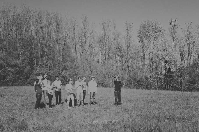
Working in fast-paced iterations, we ran a one-day workshop every week for taking a problem or feature from design through prototyping and testing. In this second part, we’ll provide a sneak peek into our design process for running a workshop and prototype Hexo+ user experience.
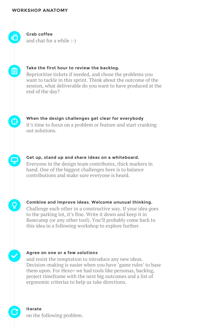
At the end of each workshop, we took at least 30 minutes with Eva (our Product Owner), Seb (CTO) and sometime a software developer to share and validate solutions together. Then we all cleared our calendars and planned for the next iteration, listing problems we wanted to tackle when possible.
Once design solutions were validated by the PO and the team, it was time to produce the outcomes before the next iteration:
- wrap-up and centralise what was produced during the workshop in Basecamp. Create relevant tickets in the design project backlog in Jira and share it with the whole team;
- integrate the solutions we agreed upon in a rough storyboard of Hexo+ overall user experience (drone + app). We had two different flows for the mobile app because IOS and Android standards are different;
- transform our lousy sketches into awesome interface mockups using Photoshop and Marvel app, and pass it on to the development team to implement design solutions in the prototype (Nico’s job);
- provide a new version of the storyboards with high-res mockups and keep them visible on a wall so that everyone can give feedback.
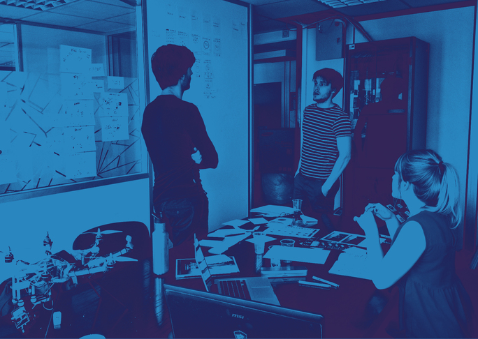
This collaboration process worked well all along the project and we had a great dynamic within the group. We all had different backgrounds and skills but we played as a team and knew our role was not to push our concepts through. We were here to ensure that everything was happening in the way it needed to for the project to move to the next stage. And in the meantime, we always had a good time and the laughs were endless.
Why pairing with developers is crucial
Everything is possible, but you need to know how things work within a system to avoid bending the platform and providing impossible UX/UI. That’s why our design team paired with developers to know the system limitations and the implementation effort. Anytime we had a question we could go ask them or suggest to come and participate to our next workshop.
Let’s be honest, we made some blunders though. Things keep changing in a project, and even agile methodologies don’t prevent you from having communication issues between teams.
While designing the PreFlight Check (PFC) flow, we agreed on a progressive system check to ensure safe flying. We grouped items by categories: signal, hardware and GPS quality processing in the background before showing status. We also tried to time the sequence to have consistent response times, keeping in mind a few basic usability rules from (Nielsen Norman Group):
- 0.1 second is about the limit for having the user feel that the system is reacting instantaneously, meaning that no special feedback is necessary except to display the result.
- 1.0 second is about the limit for the user’s flow of thought to stay uninterrupted, even though the user will notice the delay. Normally, no special feedback is necessary during delays of more than 0.1 but less than 1.0 second, but the user does lose the feeling of operating directly on the data.
- 10 seconds is about the limit for keeping the user’s attention focused on the dialogue. For longer delays, users will want to perform other tasks while waiting for the computer to finish, so they should be given feedback indicating when the computer expects to be done. Feedback during the delay is especially important if the response time is likely to be highly variable, since users will then not know what to expect.
The thing is, we realized timing the sequence was absolutely impossible. There were too many unknowns, depending on the context you’re in. For example, it would be really hard for us to anticipate the response time of the GPS signal and quality when a user is at the top of a mountain ready to snowboard and be filmed by his drone.
Designing the PreFlight Check
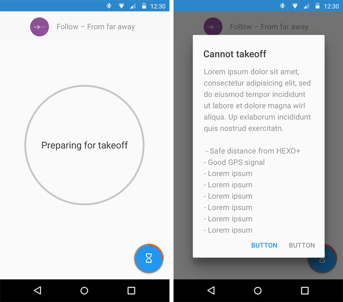
- We needed to improve the PreFlight Check (PFC) displaying a modal dialog with a troubleshooting list.
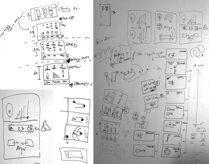
- We sketched as many different directions as we could, picking the best ones and then test them out in a prototype. We tried to clarify things by grouping items and splitting screens, checking one group at a time. The solution was approved, and we moved on to the next design problem only to realise a few weeks later that the PFC specs had changed while developing the app.
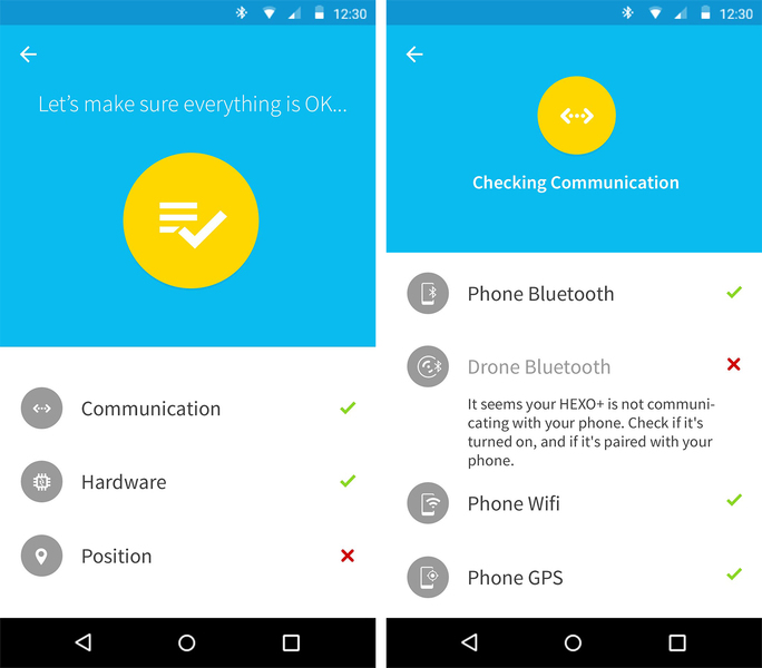
- With both dev and design teams we agreed on displaying an overview with a list of 3 items (Communication, Hardware, Position) showing a status (good / bad) and a detailed view for each group.
Another issue we had to face is the stabilisation of design approval. Stay tuned for the next episode, where we’ll talk about how feedback can be both extremely valuable and hard to manage.