
User testing and decision-making (part #3)
How we iterated on feedback
After running each workshop, we got a lot of ideas down on paper. It’s good to have ideas but you can’t test and build ‘em all. You have to make decisions. In the previous article, we talked about how we agreed on one or a few solutions and resisted the temptation to introduce any new ideas. Well, we did. Most of the time. But stabilising a design approval can be tricky. In the final two parts of the article series, we’ll talk about our decision-making process and how feedback can be both extremely valuable and hard to manage.

Set the rules of the game
Decision-making is easier when you stick to rules. But no need for too much documentation! Documents are hard to keep up-to-date and become less relevant as the team moves forward.
For designing the Hexo+ mobile app our team decided to prototype early and replace abstract documents with concrete customer feedback. But we also created a few game rules that have proven really helpful along the way. We used them anytime we had different approaches to solving a problem, or a doubt regarding what direction to take for the next sprint or release.
Standards, it’s all about standards!
IOS and Android guidelines
We respected Android and IOS standards and based our UI on these guidelines. We created two different storyboards, one for each OS. We tried to build a look-and-feel as consistent as possible across both platforms.
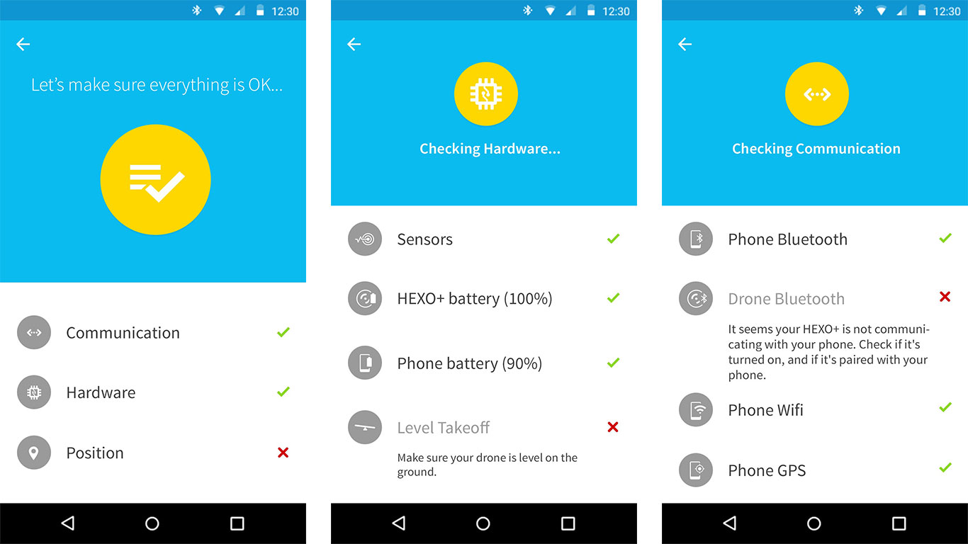
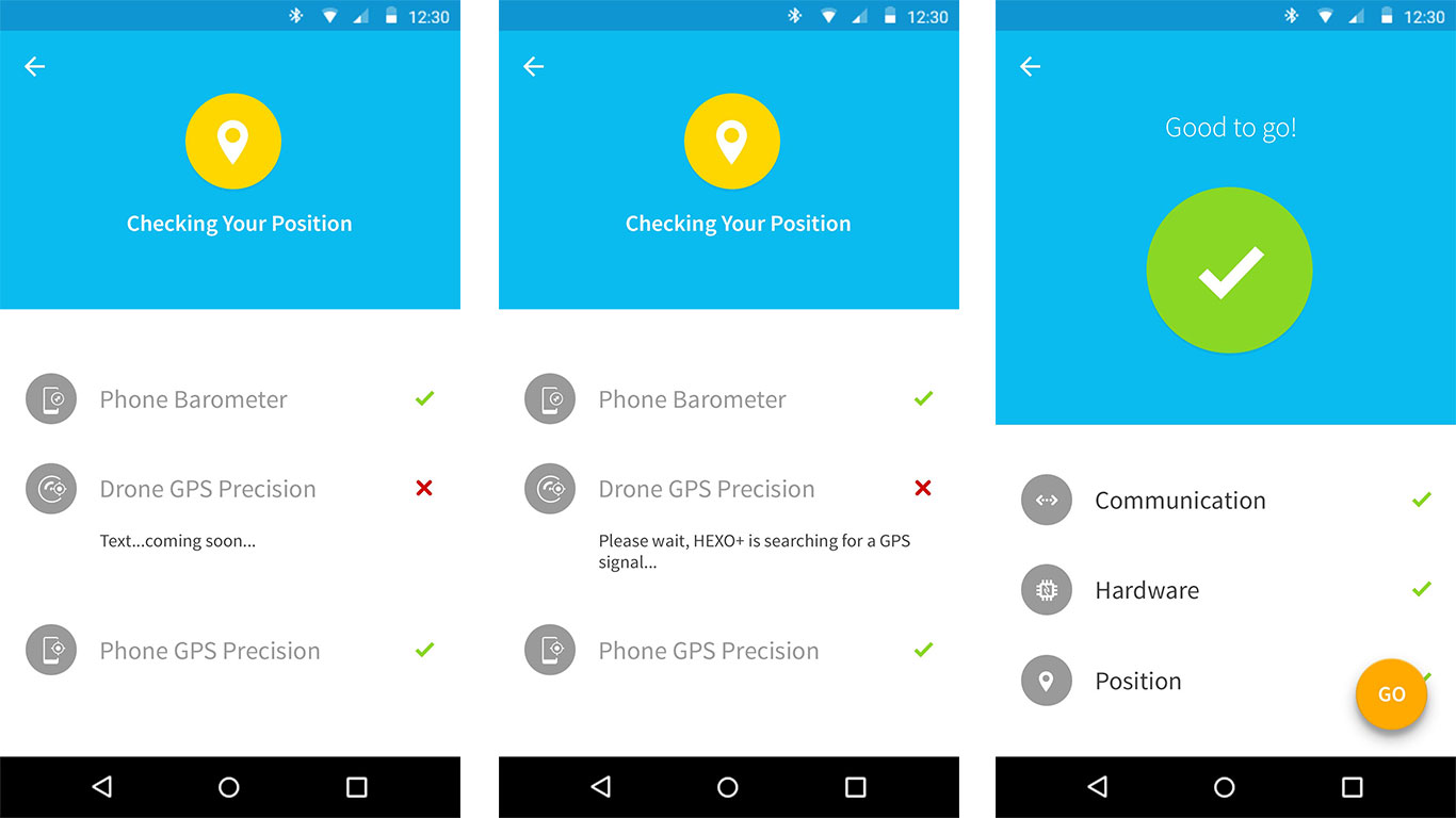
Pre-Flight Check for Android.
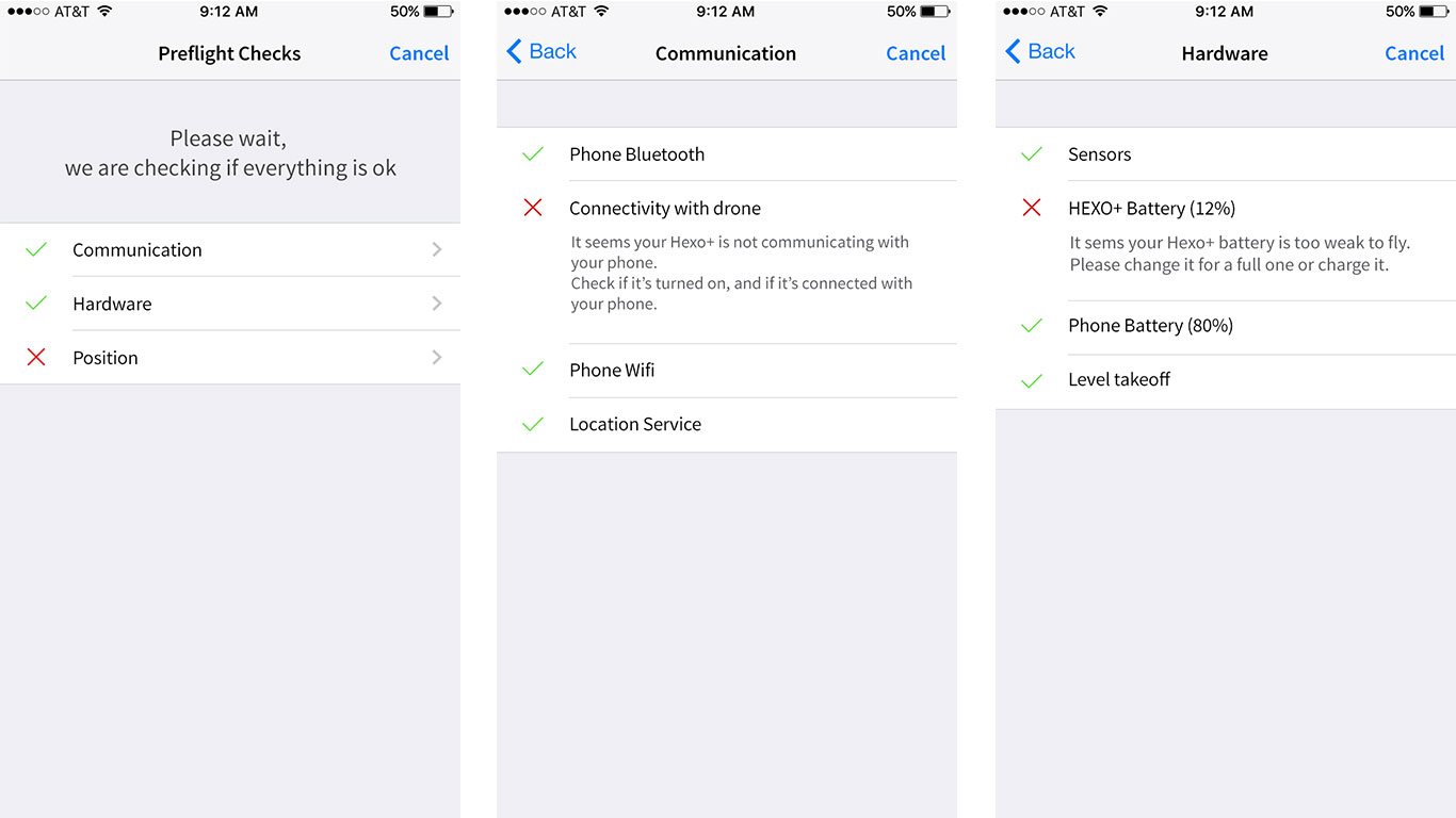
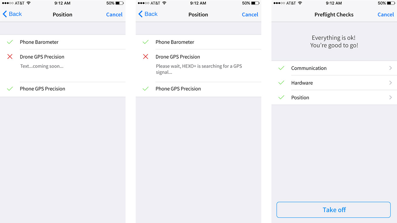
Pre-Flight Check for IOS.
We also shared visual and usability guidelines in order to maintain design consistency and communicate behavior to the engineering team. Our 5 top concerns were:
- Respect standards and avoid ‘surprise’ effects;
- Break standards when needed, especially for an action-oriented product (meaning as less interaction with a screen as possible, larger buttons, readable typography, etc.);
- Organise information and clearly separate sequences;
- Streamline user experience but make room for ‘ha-ha’ moments;
- Provide immediate feedback (visual, sonor, haptic).
Iterate, iterate again and remember your product’s story
As we were designing and building the Hexo+ apps we were always talking about the original mission: helping people capture aerial footage of themselves, ‘hands-free’. The conversation started with ‘Let’s have a ton of custom movements so that people can have a rich interaction with the product’. We tossed around the idea of potentially allowing people to set manually camera angles, distance and altitude.
Technically we could have let people do this kind of stuff, but after a few tests we realised how complex and creepy this feature was:
- Imagine you’re on the top of a mountain in broad daylight at 5000+ lumen, on a small resolution screen and wearing gloves because you are riding. You want to set the right angle, distance and altitude for your 360. Good luck with that.
- The possibility of customising movement adds complexity. You need to mentally represent yourself and the drone in a 3D environment to set up your camera movement. Figuring out where you are in space, and where the drone is from your position is not easy. And you probably want to test and learn how the drone is moving around before going further with custom stuff.
Customising movements was in fact a pain in the ass and would have cost us a lot in term of development and design. We were getting carried away and our tests clearly demonstrated it. We needed to simplify. And stick to our story: ‘Capture aerial footage of yourself, hands-free’. Hands-free. No hands, no digital interface (or as less as possible), no screen-based thinking.
Embracing a typical process means you can do what you normally do in real life. Avoiding a digital interface means you don’t waste time learning, troubleshooting, and using a screen you don’t need to be using anyway.
‘The Best Interface Is No Interface: The Simple Path to Brilliant Technology’, by Golden Krishna, New Riders, 2015.
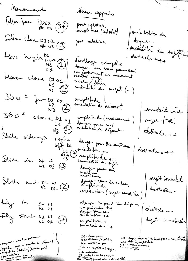
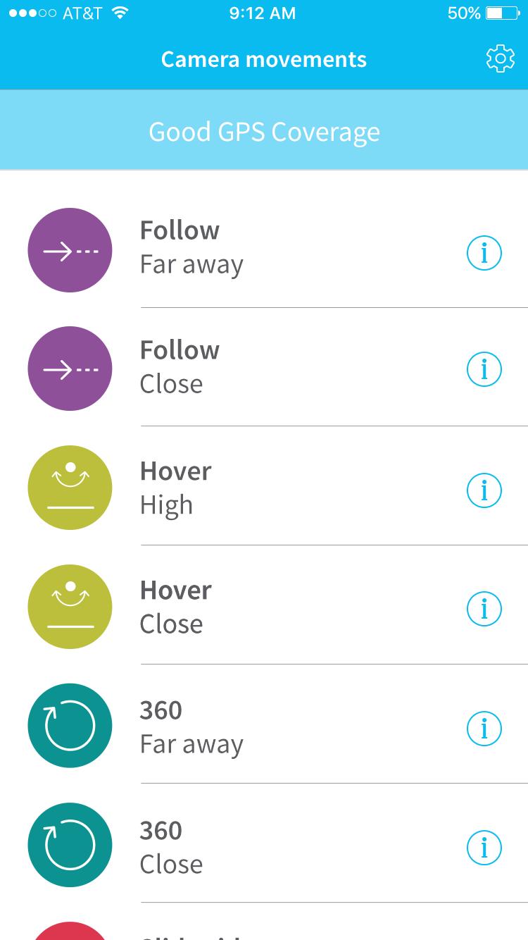
Learning from our observations during user testing sessions, we tried to reframe our design from a digital screen to a natural course of actions. The conversation became ‘Let’s have a small list of pre-setted movements so that people can go film themselves doing stuff as soon as possible’. We ended up with a list of 12 pre-setted movements.
Why 12? Because more than 12 different items in a list introduces cognitive complexity. User’s attention span is short, especially in our context (action sport), where you need to focus on the action, not on the interface. Also, having too much choice can be overwhelming. We simplified our list by recommending a set of cool camera movements. We chuncked over 250 movements combinations into 6 family groups: Hover, 360, Follow, Slide sideways, Slide, Fly. Then we chose the two ‘best movements’ of each family. They would provide the best visual results and would adapt to the most situations.
We knew our 12 pre-setted movements would make awesome footages. We tested them on the field.
Simplifying the list of movements on a whiteboard during a workshop.
List of 12 pre-setted movements.

Follow camera movement in action.
What next?
In the next article we’ll talk about how we dealt with feedback and paired with engineering to stabilise recommendation.